Negative space in photography, design, sculpture or any other creative pursuit is equally as important as is positive space in overall composition.
It’s all about finding the right balance.
Simply put, positive space is the actual subject while negative space (also called white space) is the area surrounding the subject.
The latter acts as breathing room for your eyes. Too little negative space results in cluttered and busy photographs with every element in the photo screaming for the viewer’s attention.
In the photo above, part of my London street photography collection, the man standing on the right, the subject, is the positive space whereas the entire orange wall is the negative space, the empty space which helps the subject stand out better.
Allowing for a generous area of negative space can have a very positive effect on the finished work.
It adds definition to your subject and is similar to a visual pause. It reduces the negative impact of a busy composition by acting as buffer, an area in which the eye can rest.
It can also add to the mystery, it invites the viewer to make up the rest of the story and can greatly affect the emotion, the mood of the photo.
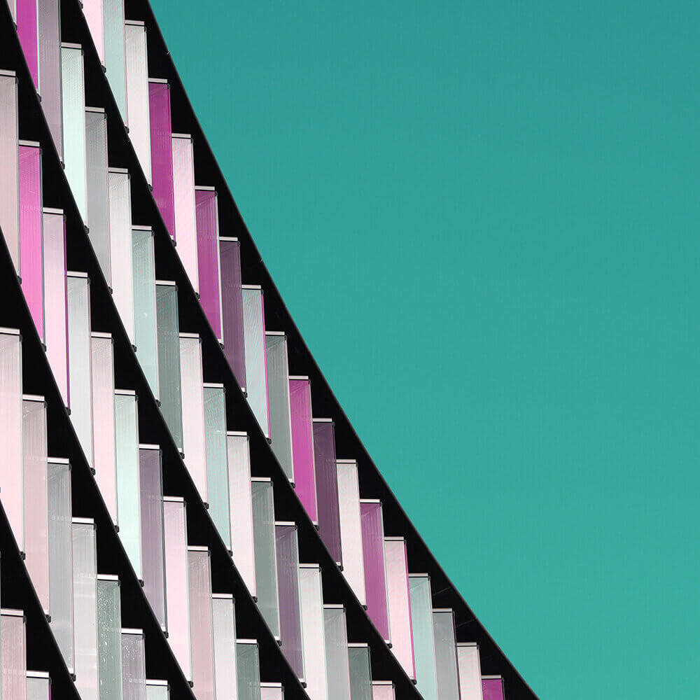
In my photography work I often seek to create compositions by maximising the use of negative space resulting in seemingly more minimal, less cluttered images, for example in my minimal urban photography series as demonstrated in the example below:
This body of work highlights details of architecture around London and is all shot in square format. Reducing everything to the bare minimum, the result is a set of photographs that are easy to absorb and perfect to compliment interiors.
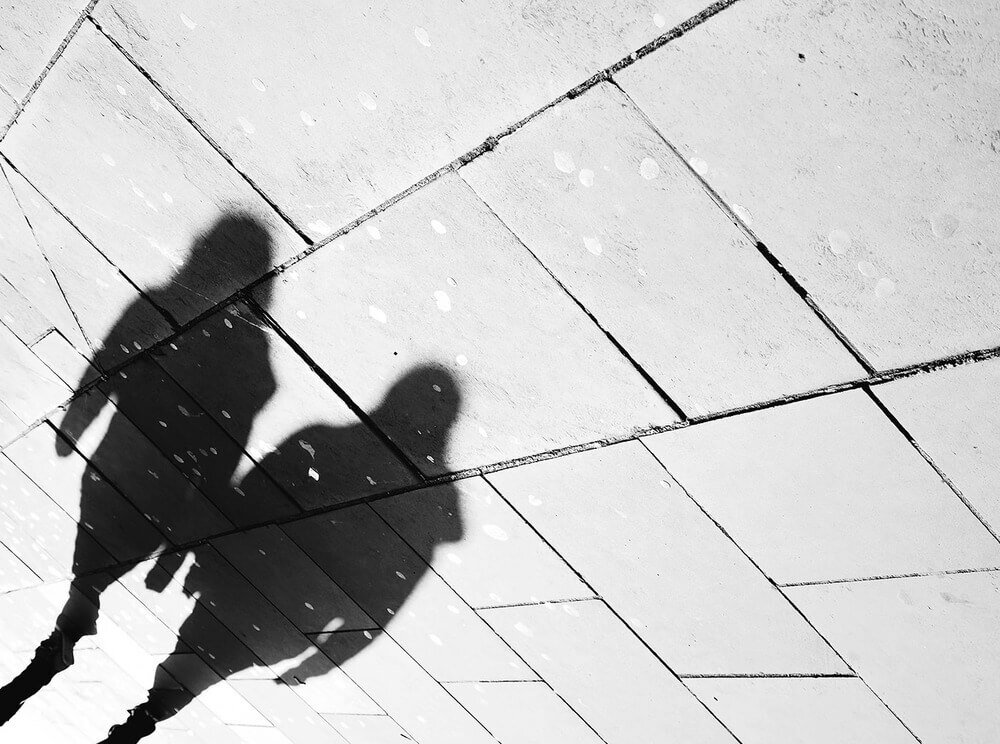
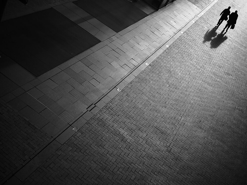
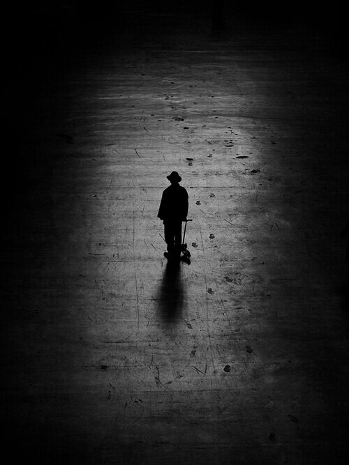
The use of negative space is always on my mind in the street photography I shoot around London in such photographs for example:
You could very much call this minimal street photography.
People are still the main focus yet do not make for most part of the photo, a visual representation of less being more. The empty space actually does makes the subject stand out and the eye is automatically guided there.
How do you shoot? Do you try think how empty space affects your photos?
Drop a comment and let me know.
Please also share and like this article if indeed you enjoyed it!
Until next time.


